The Dashboard gives a consolidated view of applications, team activity, and portfolio risk. It is divided into three sections: Pipeline, which tracks application volume and approvals over time or by industry; Team Performance, which highlights individual and team activity, including case assignments; and Risk Analysis, which provides insight into portfolio health, industry exposure, and key risk alerts. Together, these sections offer a clear snapshot of overall performance, workflow efficiency, and emerging risks.
Pipeline
This section displays charts and graphs related to applications received. Data can be filtered by 24 Hours, 7 Days, 30 Days, 12 Months, or by Industry. Available charts include:
- Applications Received vs. Approved
- Total Applications
- Time to Approval

Team Performance
This section provides charts and snapshots of team activity. Data can be filtered by team member. Available visualizations include:
- Applications Received vs. Approved
- Time to Approval
- Table of all Cases at the bottom

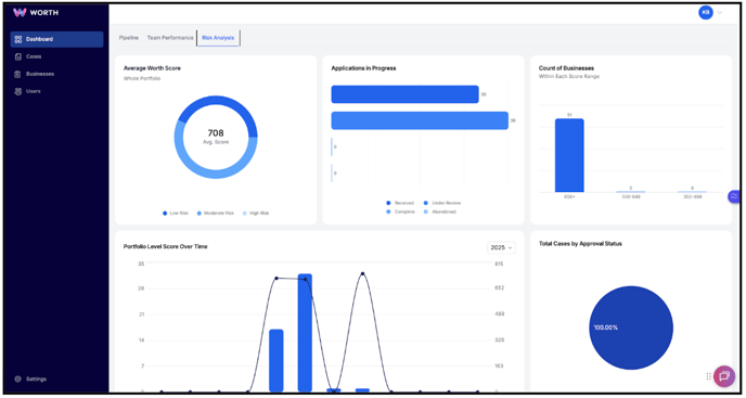
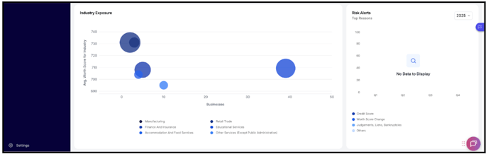
Risk Analysis
This section provides charts to help Risk Analysts track key metrics. Available visualizations include:
- Average Worth Score
- Applications in Progress
- Count of Businesses
- Portfolio Level Score Over Time
- Total Cases by Approval Status
- Industry Exposure
- Risk Alerts